FLAIR Firework Company - Style, Safety, and Spectacle

Project Introduction
FLAIR is a firework company that aims to bring a much needed sense of style, sophistication, and entertainment to the firework industry. With many firework brands and companies embracing a more gaudy, clashing, and comedic oriented aesthetic to their product lines, FLAIR desires to return to the classic 70’s and 80’s era of firework package designs, and to be a trusted source of pyrotechnic entertainment.
The intended goal of this project was to create the first of a series of fireworks along with the logo for the company, and to take on the challenge of creating packaging for an industry with a concern for safety precautions, legal stipulations, and otherwise poor branding.
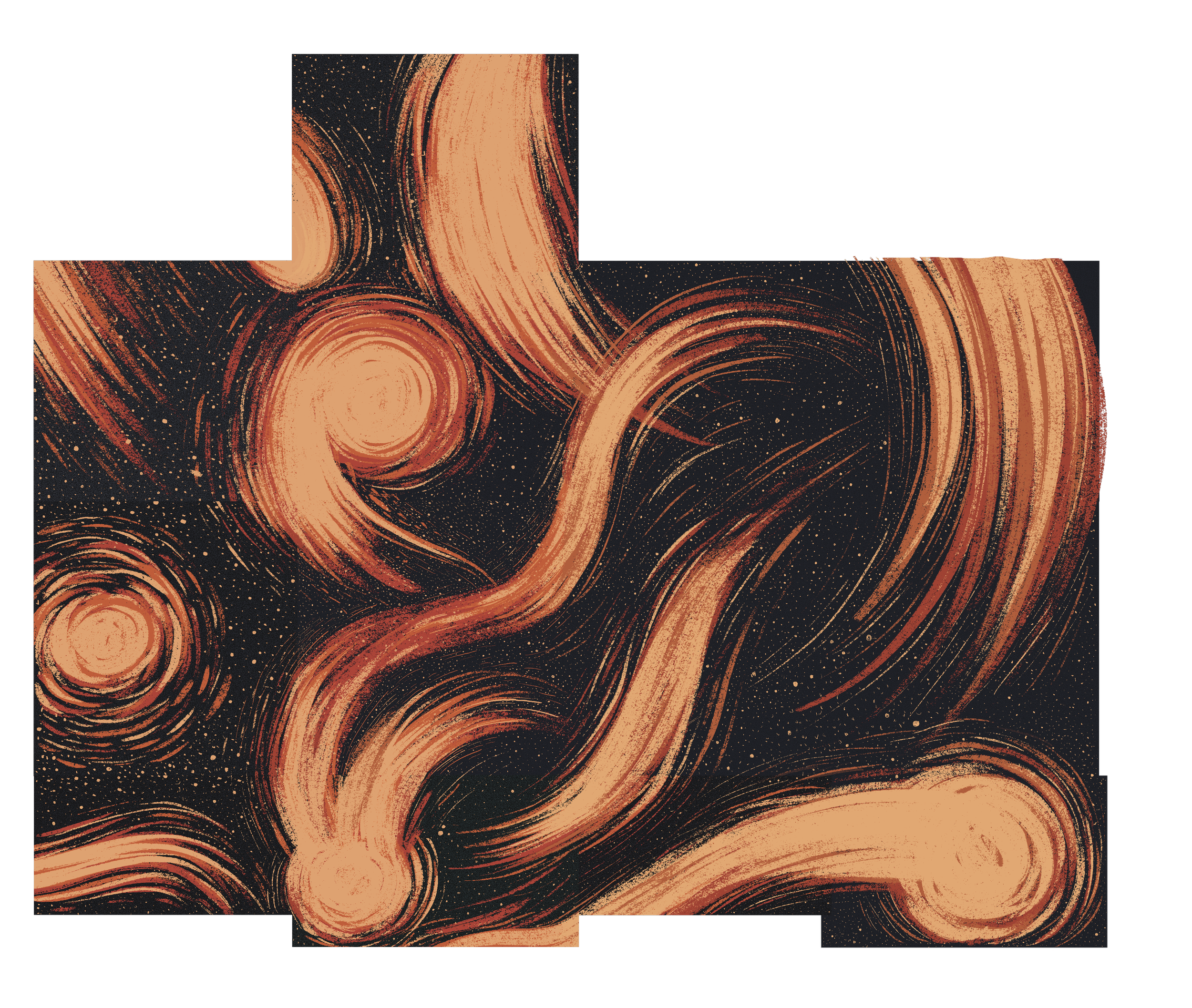
The company’s aesthetic is inspired by 70’s and 80’s era firework packages and illustrations, especially for firecrackers, roman candles, and sparklers. It aims to stand out in the industry by having a solar flair, outer space theme to its branding, naming its fireworks after constellations and planetary bodies, and theming its packaging off of retro space age designs.


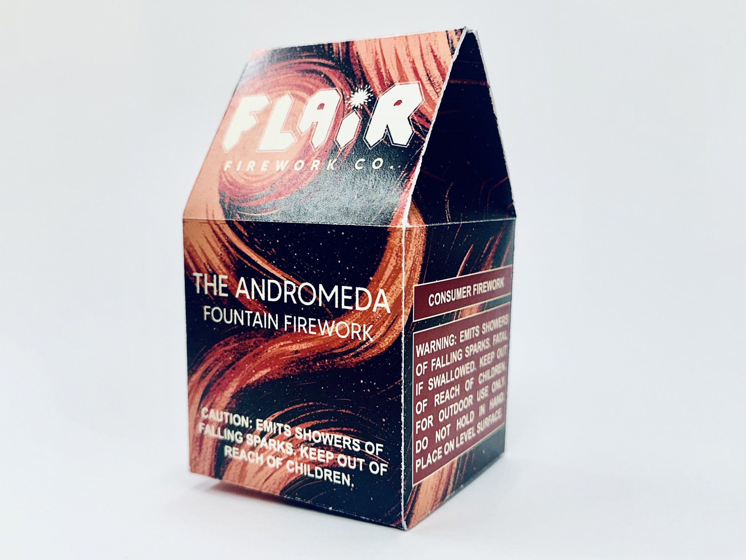
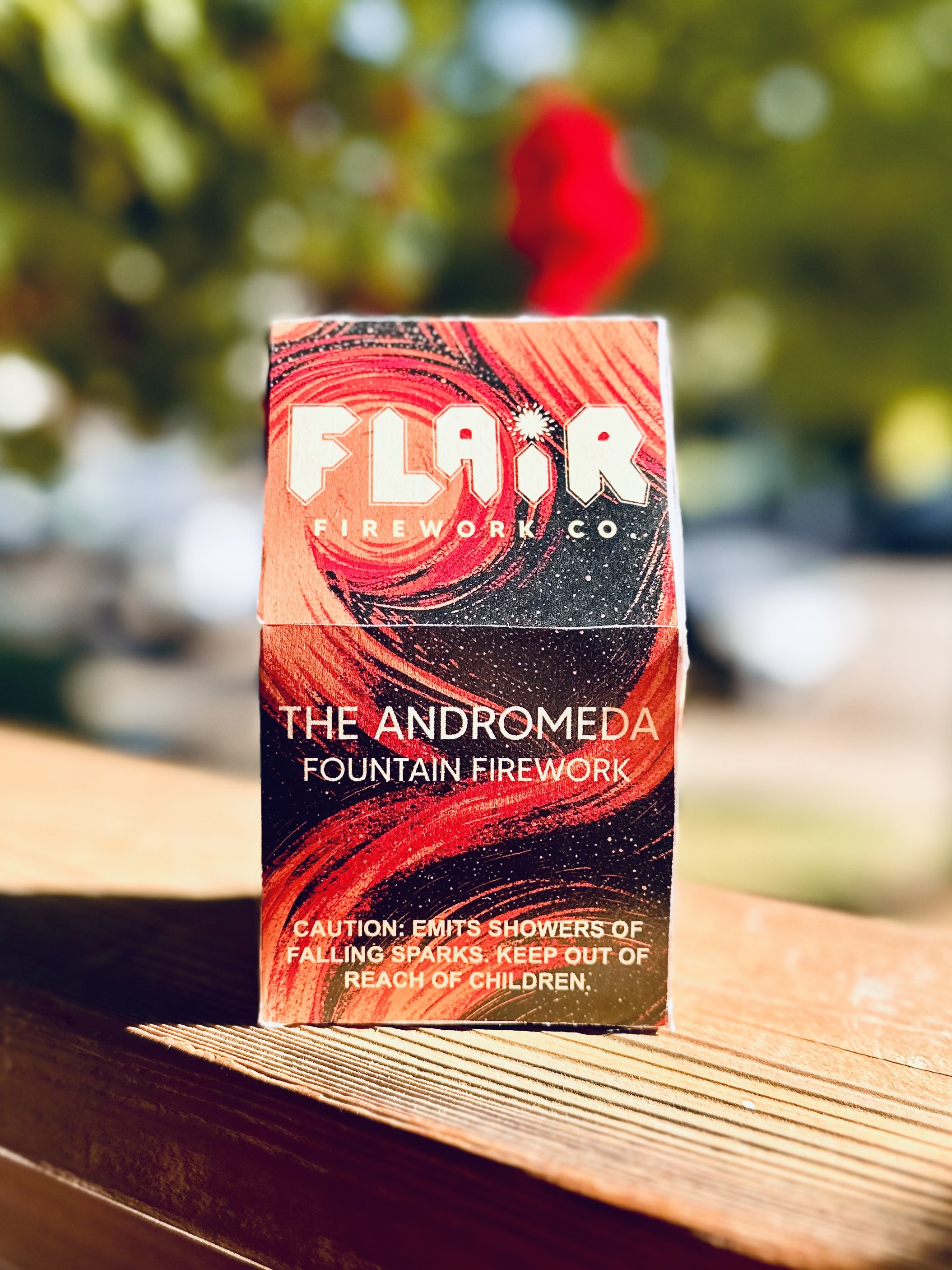
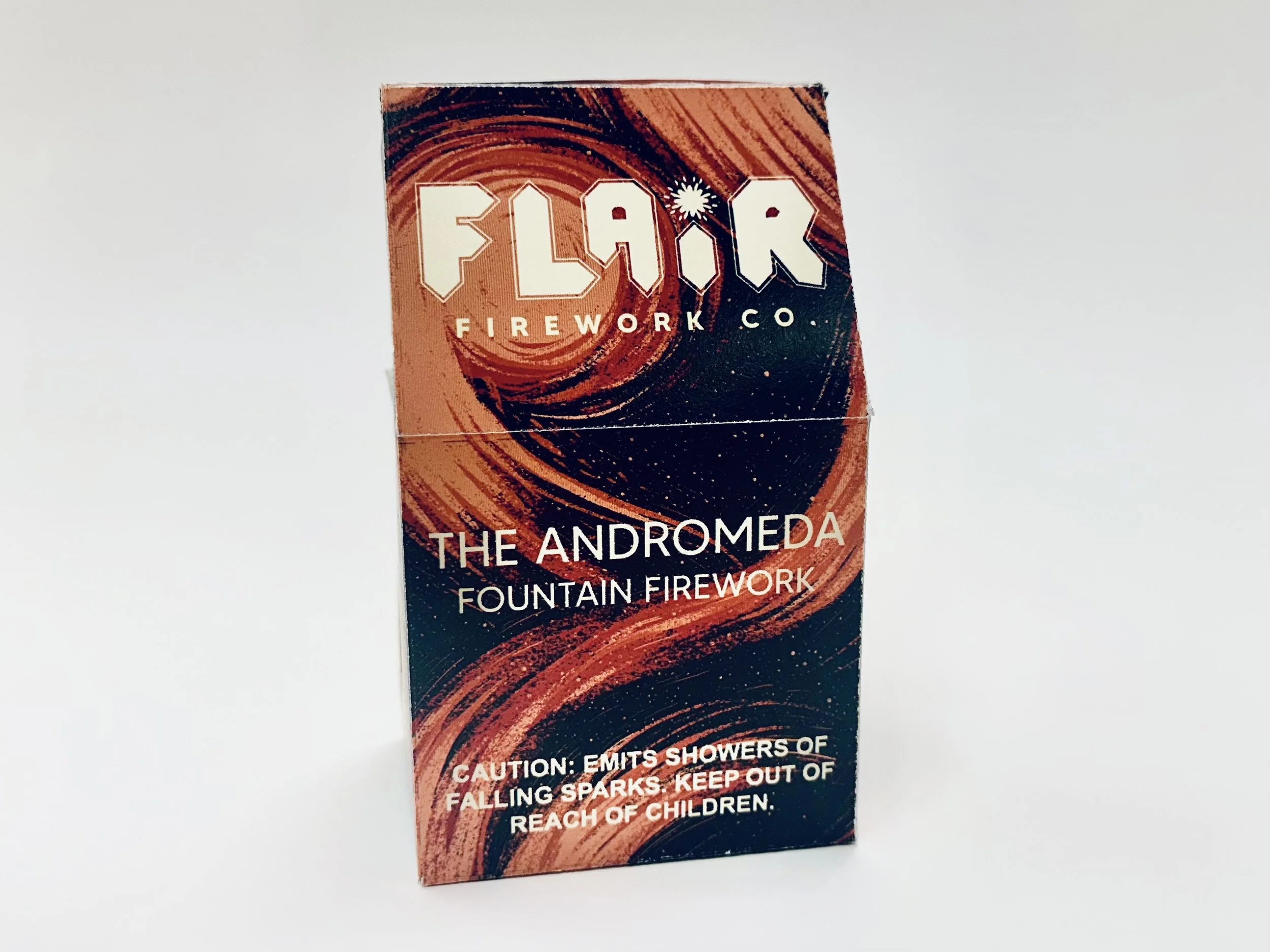
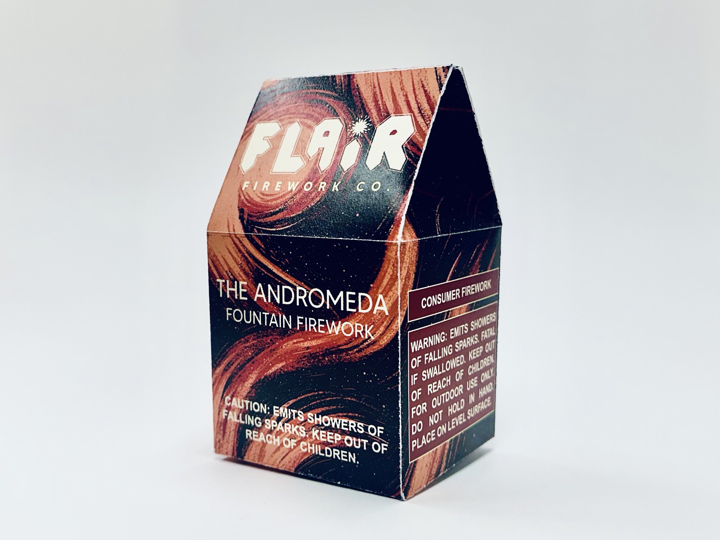
When it came to choosing a packaging style for the actual firework, I was inspired to use a die-line that would have a flap to open but that would be slightly difficult for young children to open, to ensure as much safety as is possible with a flammable product. I chose a die-line of a large tea bag box that had the flap style I was looking for, and constructed the package design based on that initial package.


The Logo

Out of all my logo sketches, this is the one that stood out the most to me. It captured the burst of a firework while having a bold yet sharp shape reminiscent of some of my favorite rock bands from the 70’s-90’s, and I continued to pull from those similarities as I developed the logo, keeping the outer border look similar to that of ACDC or Iron Maiden, and reformed the letters to have a more consistent shape language across the entire wordmark.
This was my first project where I built a logo completely from scratch without a font to start off with, which was an interesting challenge but one that gave me invaluable flexibility with the type shape language.
This is what came from the building block experimentation, the unique, bold, eye catching logo of FLAIR

The Illustration Style
Something I found to be very inspiring from the era I was referencing was the more chalk-like, gritty, grainy texture of vintage packaging, and I tried to reflect that in my artwork for the package, using pastel and grain brushes to design solar flairs and shooting stars across the packaging.
Putting it all together
Now that I had everything I needed, I began adding text to the package design, paying careful attention to labeling requirements for fireworks that I had found during my research. One major addition is the mandatory caution/warning labels on all visible sides of the package.
I also had to distinguish that this package is for a consumer firework, not a commercial one. Consumer fireworks are approved for the individual to purchase, but commercial fireworks would be considered illegal in most of the United States for personal use, and are only supposed to be used for pyrotechnic displays and shows, for practical effects in the film industry, and for large scale events.
I also added a QR code for customers to buy so they can have a chance to see the firework in action before committing to purchasing it.
The Andromeda Firework Itself


Find, Follow, or Contact Me
email: info@abigaillynn.art
You can find me @abigaillynnarts on the following social media / ecommerce platforms