On The Verge - Creating Community Through Camping
Case Study Overview/Brief
On The Verge is a fictional camping supply company focusing on community, nature, and accessibility. The idea for this project came from the prompt to simply create something that reflects and demonstrates one of my personal values, and I chose community as the value to showcase.
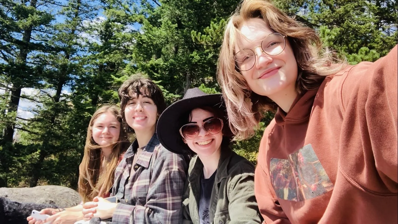
In my personal life, one of the best community building and memory making experiences I was able to partake in was going camping with my friends in the middle of Washington for four days. We connected with nature, each other, and ourselves.
However, after the trip, my friends and I realized camping, while fun, isn’t an easily accessible activity. Camping gear and supplies are expensive, and most people don’t have the storage space to keep lots of camping supplies. Many camping companies also place heavy emphasis on competitive or sports / athletic camping, which can make the activity seem intimidating rather than fun. To solve these problems, I figured a new company would need to be made that would focus on renting out camping gear and supplies, teach, guide, and welcome new campers to experience the fun of camping, and provide rentable vehicles to campers who would prefer to not sleep in a tent. Thus, On The Verge was born.
Initial Concepting / Sketching
I was only given about a week and a half to bring this project together, so for the logo I just wanted to create something simple and easy to read but that had a slightly rustic charm to it.
I also sketched various iterations of a lantern icon, which was met with very positive feedback. Because the core of this project is community, it was expressed that the use of a lantern as the primary brand icon establishes a tone of warmth, comfort, and optimism for the company.
I also stuck with dark green as my primary brand color to keep in touch with the nature aspect of the brand.
I also sketched out various different types of monograms for the brand, since a monogram is much easier to apply to metallic items such as anything that would be applied to vehicles, or on some of the equipment mockups you’ll see later such as the flashlight.
Logo Variations
After spending some time considering the applications for the logo, this is the set of logo variations I came up with for the project, including the monogram and the lantern Icon I had mentioned previously.
The monogram, horizontal, and stacked variations are the logos I ended up using the most once I moved into the mockup stage of the project.
On The Verge - Out in the Wild
The first set of products I designed for the company were supplies that some campers may not already have on hand that would be better to rent rather than purchase, such as thermal mugs, water bottles, cooking supplies, and coolers.


I also looked into creating mockups for more functional camping supplies that I would have enjoyed having when I went camping with my friends, especially a flashlight for night walks and a lighter to get a fire going more quickly.
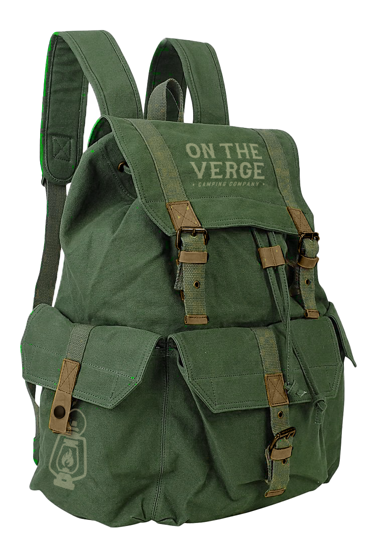
Another set of items I decided to make are camping bags as well as actual tents, since tents are the most space consuming camping supply, and my friends and I agreed it would be nice if we could rent a tent rather than rely on one friend to store it at her home
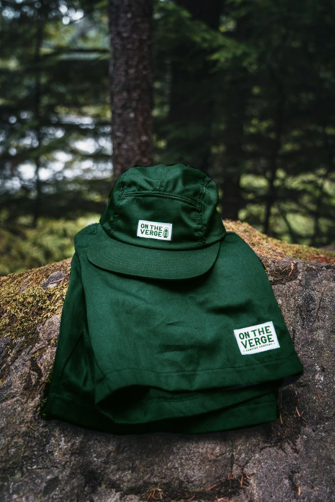
Finally, I created a line of vehicle mockups for campers who would like a little more comfort while being out in nature than using just a tent. These are branded with the company logo and colors.
Find, Follow, or Contact Me
email: info@abigaillynn.art
You can find me @abigaillynnarts on the following social media / ecommerce platforms


